
Getting good skin tones is normally a matter of getting the white balance right. And trust me, the camera rarely gets it right on its own.
An incorrect white balance shows up clearly in studio shots, where the most common problem is a magenta cast - overly pink. It's easy to spot when the shot has a white or grey background that looks a little pink. Trust me, nobody sells background paper in shades with "a hint of pink" - leave that to Dulux. That cast runs through the whole image, skin tones included. It's much harder to spot when there's no neutral background to give the game away - but it's still there.
Outdoors, you're more likely to see a green cast from grass and foliage.
Neither is particularly flattering.
AWB - the camera's best guess
Auto white balance is just the camera guessing based on what it sees in the frame. It might get close, or it could be way off. Crucially, what's in the image affects the guess - even the difference between shooting horizontally or vertically can produce a different result depending on what the camera sees.
Two shots from the same set should be consistent, and it would be nice if they were close to correct. Set to AWB, you have very little chance of either.
In the studio
Setting the white balance to Flash is a reasonable starting point. At least the previews will look better, and more importantly it will not keep shifting between shots.
That said, the camera's Flash setting rarely matches any given combination of lights and modifiers. Decent lights should be consistent in their output, but different modifiers introduce their own variation - and that can change as they age. Set it and check it.
Outdoors
Sunlight is fairly constant for most of the day, but clouds and shade will have an effect. What is more likely to influence your shots, though, is the surroundings - strong colours reflect a cast, most commonly green from grass and foliage. You might tell someone they look a little green if they are unwell, but it is not how you would want to describe their skin in a portrait.
Getting it right
Get a grey card. Shoot it somewhere in each set, then use it to batch correct your images in post. Something like this one on Amazon (affiliate link) is inexpensive and adequate to get started.
You can set a custom white balance in-camera, but that is a faff, and it is easy to forget. Correcting afterwards is straightforward - and it does not matter when you shoot the grey card, beginning, middle, or end of the set. Use the white balance eyedropper in Lightroom and sync the values across all the images.
In the studio, shoot a new grey card if you change modifiers - do not assume they will be consistent with each other. Outdoors, a change of location is an obvious cue for a new shot; use your judgement for changes in light within the same location.
A note on subjectivity
Technically correct is not always the final destination - it might not be aesthetically pleasing. Warmer tones are a perfectly valid creative choice - just start from somewhere close to correct and adjust to taste (leaving the green/magenta tint adjustment alone). There is a big difference between a considered warm tone and an accidental pink cast.
Subjectivity isn't really an option on a commercial job - accurate colours matching the real garment or product become very important and then we're looking at custom camera profiles, not just white balance. That's a whole topic on its own though.
One more thing
This primarily applies to raw files. JPEGs are much harder to correct - the white balance is baked in, and there is far less latitude when adjusting them. Another reason to shoot raw.
It is an extra shot now and again and a couple of clicks to sort a whole set. It can be a subtle adjustment, but it is one of those small things that quietly elevates your work.
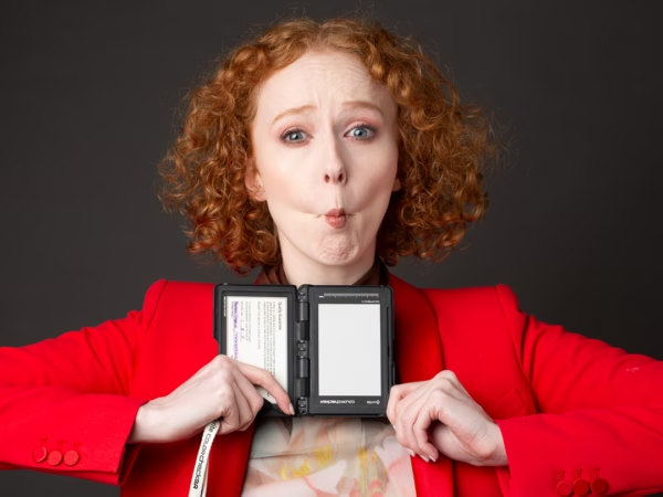
The before/after image below shows the difference - the corrected version is both less blue and less magenta. And as a bonus, experienced models will give you an excellent collection of goofball grey card shots.

White balance correction - before and after. The corrected version is less blue and less magenta (and subjectively maybe a little warmer than I'd prefer).
White balance is one of the topics we cover in more depth when we're teaching - along with exposure, lighting, and getting the most from your images in post. If you would like to learn more, take a look at what we teach.
Questions? Get in touch.